Seating charts have become trendy over the last few years. They are a more picturesque way to tell your guests where to sit for dinner than the traditional escort cards. They are often so beautiful, they become a featured part of the decor.
However, I have worked with many couples who have not thought out the design very well… or their hired designer didn’t. Take a look at these 2 examples of seating charts:
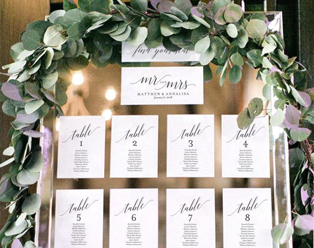
Image #1 - Sorted by Table Number
This looks great because there are probably the same number of guests at each table. The layout is a linear grid with even spacing. However, it takes longer for guests to find their names and table assignment. This becomes especially problematic when you have a large guest list.
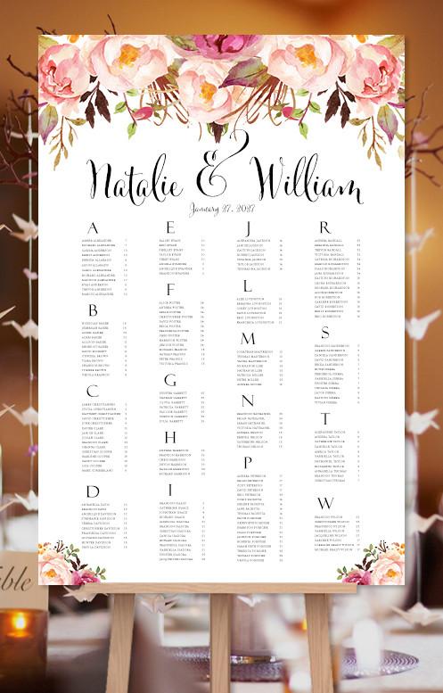
Image #2 - Sorted Alphabetically by Last Name
This is also a beautiful design with the headings printed in large font to make it easy for guests to find their names and then the table number next to their name.
We recommend sorting alphabetically to get your guests seated quickly (with minimal confusion) so the rest of your agenda can continue without delay.
If you like the wedding and event planning tips provided in our blog, please come back often to read more.
If you need individual attention and guidance to plan the event of your dreams, please contact us to schedule an initial meeting to discuss how we can help you. Call us at 800.941.2770. Email us at info@trilogyeventdesign.com. Or use our online calendar at https://bit.ly/2InCnAj
Until next time…


